
Every email must contain, at a minimum, personalized, segmented, a strong subject, preview text, header, body content, footer, call-to-action, opt-out, and directed to a landing page.
Seems simple enough, but most of us do not take the time to develop and execute a proper email strategy, even if it's just one email. We will briefly discuss the core elements of a standard email using various shapes and colors in order to easily reference the specific elements. Also, the goal of the example email is to notify and automatically send new blog posts to a segmented list of subscribers.
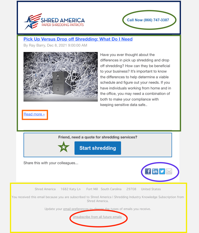
Shapes and colors, are defined.
- Top, dark navy blue rectangle = Header
- Top, green oval inside "header" = Click-to-call CTA (call-to-action)
- Middle, green large square = Body
- Small, orange rectangle = Hyperlink to full article CTA
- Green star = Personalization, and CTA to a specific landing page.
- Purple oval = Ability to easily share with others CTA
- Bottom, yellow rectangle = Footer
- Bottom, red oval = Opt-out
It's required by law for every email to include the ability to unsubscribe from future email communication. You can read more on the FTC website.
The function of each element.
Remember, our goal is to provide a basic understanding of creating a good email and you can always send us an email to request more information.
Personalized
You'll notice in the light blue square a sentence, "Friend, need a quote for shredding services?" "Friend" is the default first name text we have programmed if we do not have the first name of the email recipient; if we have the first name in our CRM, then the CTA reads, "Brannon, need a quote for shredding services?"
Do: Work it in naturally.
Don't: Use improper cases or misspell their name.
Segment
Every email service provider has some degree of list segmentation, use it. Everyone does not want to hear the same message. For example, do you want to send the same residential tax season purge email to the managing partners of a multi-location law firm? No!
Examples of segmentation:
- Doctors' offices in zip codes 12345, 54321, 21345, & 32145; lost deal in the last two years; currently have document storage service with us.
- Route 1, residential purge between Jan-Apr of last year.
- Current client in the legal, medical, or finance industry; recurring service; monthly billable amount over $200; in Route 1, 2, and 3.
Do: Be specific. Group by a primary category, then two to three sub-categories.
Don't: Miss this step!
Subject (example not shown above)
Why you are contacting the user via email. No BS. Just get to the point and make it personal. Which subject line would you open:
- Digital marketing services for your shredding company. OR
- [[First name]], tired of pointless conversations 😫 with marketing agencies? Me too!
Do: Be funny, use emojis, personalize, and - in most cases - ask a question.
Don't: Use general subjects.
Preview text (example not shown above)
Just a brief summary of what you are wanting them to read and WHY they should open the email. A pretty important piece of the email.
Would the following preview text entice you to open an email with "Subject: 2" from above:
"Agencies harass me and you, from sun up to sundown, but I can guarantee you they do not have ownership in a shredding company like we do. We understand your day-to-day, your customers, employees, and how to generate more business."
Do: Get to the point. Summarize the email.
Don't: Leave empty. Mislead.
Header
The very top of the email, just like your head is the top of your body. In most cases, your company logo with a hyperlink to your home page and a call-to-action - we used a click-to-call sense most people view email on their phone and this email is targeting prospective buyers.
Make the header as simple as possible because this is typically the second impression a user will have once they open the email.
Do: Make sure image resolution can adjust across devices.
Don't: Jam it up with imagery.
Body
Get to the point and do not waste someone's time. Our example provides the opening paragraph to the blog article with the ability for the user to read more at their leisure.
Do: Use small two to three-sentence paragraphs to keep the reader engaged.
Don't: Use text that is way too big or small.
Check out our blog on "Email signatures dos and don'ts."
Footer
Used for general information about your company such as an address, website, social media, etc.
Do Simple and Plain Jane.
Don't: Forget a link for email recipients to unsubscribe.
Call-to-action (CTA)
They can be used in any section of the email and multiple times within the same email. Just make sure each CTA serves a distinct purpose. Our example contains four CTA's 1) click-to-call, 2) "Read More", 3) "Start Shredding" and 4) send to a friend via email, text, or social media.
Do: Use hyperlinks, buttons, images, etc. Mix it up.
Don't: Have deadlinks.
CAN-SPAM Act
Pretty simple, don't break the law by sending emails to individuals who have unsubscribed before, from a list you purchased, and/or found on the Internet.
Do: Remove any unsubscribe request within 10 days of receiving the request.
Don't: Risk it because it can cost you thousands of dollars.
Landing page
Okay, now you have their attention and they clicked through the email to your landing page. You have about 5-7 seconds to keep their attention, so you better be direct in the action you want them to take.
Do: Write very specific content that solves their pain point.
Don't: Lead them to a general webpage or standard contact form.
Would you like to learn more about email marketing? Just click here to learn more.